Blog
The carousel solution nobody asked to be this effective
Sometimes the boring solution is the one that works, and you have to sit with that.
The Problem
People landed on Negativo.es and did not understand what it was.
Not because the copy was bad. Not because the design was ugly. Because "an app to track your film cameras and rolls" is one of those sentences that means everything to me and nothing to someone who has never had this problem written down.
The landing page had text. It had features. It had all the right words in all the right boxes. And visitors still left without knowing what the screens looked like or what using it actually felt like.
You cannot explain an interface with adjectives.
The Simple Carousel
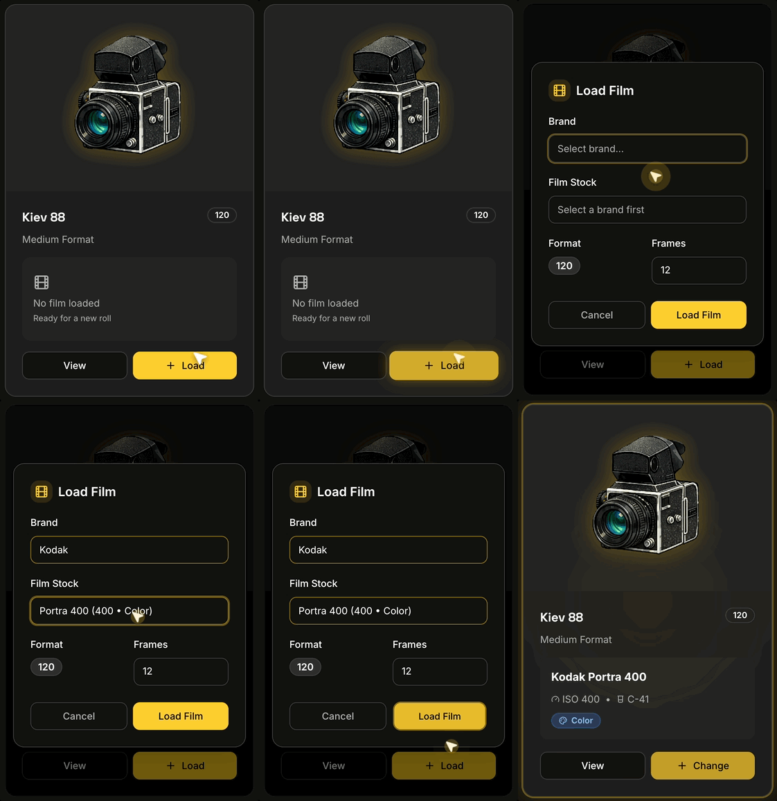
So I added a carousel. Real screens, one after another, cycling on their own.
That is it. A few frames of the actual product: the camera list, a loaded roll, the film stocks page, the roll history. No narration. No overlay explaining what you are looking at. Just the app, moving.
It took an afternoon. It is the least clever thing on the whole site.
What I Did Not Do
I want to be specific about the temptations I skipped, because they are where the time usually goes:
- No interactive product tour with tooltips and a progress bar
- No video with a voiceover I would have re-recorded nine times
- No animated 3D mockup of a phone floating in space
- No "choose your path" onboarding quiz before anyone has seen the product
- No custom scroll-hijacking storytelling section
Every one of those would have been more fun to build. None of them would have answered the only question a first-time visitor has: what is this thing.
Why It Worked
It worked because it removed a translation step.
Text asks people to imagine the product. Screens just show it. When a photographer sees a camera card with "Portra 400, frame 12 of 36" on it, the whole idea lands instantly, because they already live that problem. They do not need me to describe it. They need to recognize it.
Motion helped too, but not in the way I expected. The point of the movement is not that it looks alive. It is that it promises there is more than one screen — that this is a real app with real parts, not a single mockup pretending to be a product.
The Annoying Lesson
Here is the part I did not enjoy learning: clear beats clever, and it is not close.
I spent far longer polishing animations elsewhere in the app than I spent on the thing that finally explained the product. The fix was not a better idea. It was a more obvious one, applied earlier than my ego wanted to apply it.
The instinct as a developer is to reach for the impressive solution, because the impressive solution is the interesting work. But nobody visiting a website is grading your technique. They are deciding, in about four seconds, whether this is for them.
Show them. Do not describe it to them.
Final Thoughts
The carousel is still there. It still cycles through the same handful of screens. It is still the least sophisticated thing I have built for this project, and it is probably the highest-value change the landing page has had.
I keep a note about this now, for the next time I am tempted to build something elaborate to explain something simple: try the obvious version first. It is embarrassing how often it is enough.
— One dev, still learning the boring lessons 🎞️